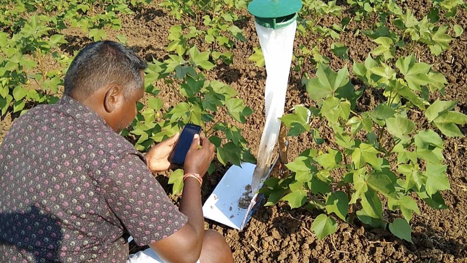
It is a tricky question to answer. How do you communicate with a set of users whose relationship with their phone is scant? Let’s take a step back. The Wadhwani Institute for Artificial Intelligence uses AI to tackle difficult problems. Most of these problems have not been solved efficiently. One of these problems is pest management in cotton farming. Cotton farmers suffer every year as pests destroy major portions of their crop. Our solution, which will be available as a mobile application can tell them how much and what pesticide needs to be sprayed. This will save them costs and help them preserve the soil as well. Our app gives actionable recommendations (spray or not to spray) to farmers based on pictures of pests on a trap. Our recommendations also include what pesticide to spray.
A few weeks ago we spoke about how we conducted a pilot of our solution remotely. The organising of this pilot is a verified success. Behind the scenes, it was user-centred design that went into it when it comes to building an app for farmers, most of whom are not digitally literate.
Designing an app for the top 10% of the pyramid is easier. Those users understand technology and are used to some level of complexity. But our users are not. Most use WhatsApp and Youtube and nothing else.
Before we started our process we asked ourselves a series of questions that helped us guide the design of our app. I want to warn you, while we write this, it is still a work in progress. A living organism evolving with each day of input and feedback. But our basic, defining questions stay the same. So, let’s walk you through our process.
How can we make a useful solution?
A useful solution can only be made if we have a good sense of the user and their needs. That is the first principle of the design process. We conducted interviews, observed behaviour on ground and use tools such as Firebase to mould our thinking.
What is our role?
Our solution is the bridge. Our expertise on their farms, which would help make faster, informed decisions. We thought of each set of our recommendation as one transaction at a time. We were on one side, the farmer on the other.
How do we speak their language?
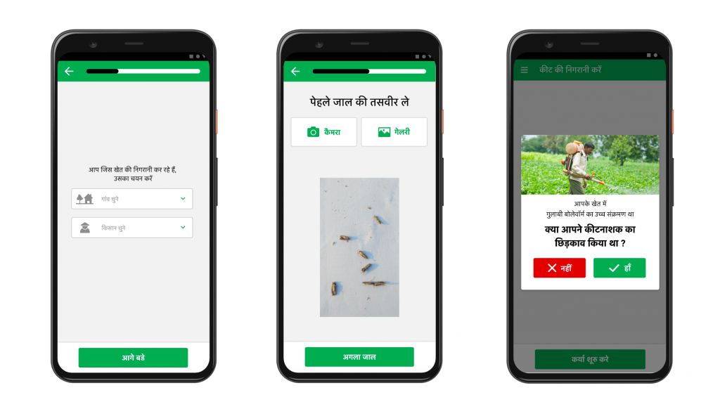
Language doesn’t just mean Kannada (in this case). We also relied on visual cues, which were brought in by introducing familiarities such as the use of camera and the gallery icons. Realistic images were used instead of abstract illustrations to help resonate with our users.
What is the best way to give a recommendation?
For digital natives, recommendations are given through choices. Use option A or option B to solve your problem. When it comes to non-natives, this becomes tricky. In our previous blog, we described how farmers didn’t understand the concept of choice. We had to find ways to make that choice obvious.
How might we design to context?
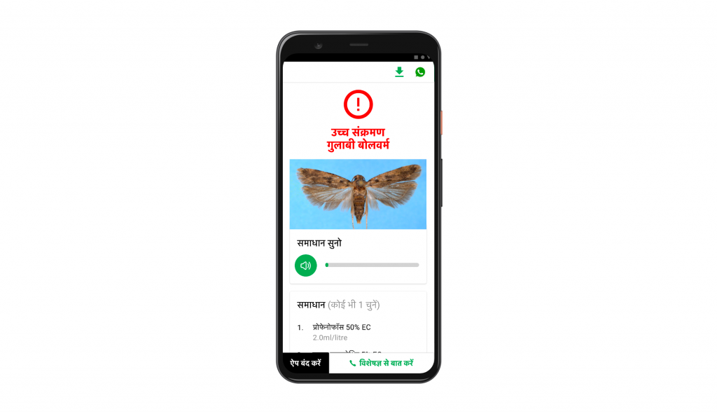
Our app will be used by farmers when they are on their farms. For an app to be used outdoors in broad daylight, we explored aspects that helped us understand what works best in terms of colour, contrast and font size. We also had to understand how we can draw attention to action and highlight what is important.
And then our thinking evolved. Because we started noticing small details. The farmers were taking screenshots of the recommendations and took them to the pesticide retailer. It meant there was a time difference between taking a picture and going to the store. Farmers were afraid that the recommendations would “disappear”. So, we gave them an option to save the recommendation as an image.
All of this is an iterative process. But we need to be sure to not send too many updates. The reason loops back with the kind of user we are dealing with it. I can give you an example, when Gmail changed its Android UX, with email and the new video chat function at the bottom of the screen, people were surprised, but they adjusted. Our users can’t be surprised. The adjustment needs to be a slow process otherwise they may feel lost and stop using the app altogether. This will continue to be a challenge going forward.
Our pilot was in Karnataka and our next step will be to reach out to farmers in Maharashtra, Gujarat and Telangana. And as we reach more farmers, our feedback loop will become stronger and we will have to make changes to the app. We will have to find a delicate compromise which will not change the app functionality, rather make it easier to use.
There is one more feature that we have held back on—the ability of our model to deliver recommendations offline. It is something we know we can roll out, but we need to wait. It is not just that the model needs to be error-proof but we need to test for some ground truths like soil composition and water along with the last recommendation provided to guide our next set of recommendations.
It’s an iterative process with a continuous feedback loop. We think of ourselves as a band of musicians listening to music on vinyl. We pay attention to every little detail. Each groove on the vinyl and each twang of the guitar guides our next steps. When we’re ready, we’ll get that album out. Watch out for it.
It looks exciting.


