Looking for Ground Truths
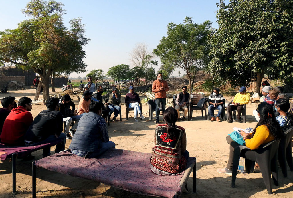
In November 2021, I was at a village in Rajasthan, conducting an on-field design research study towards improving our pest management solution. An important part of this exercise was interacting with the cotton farmers in the village about their farming practices and everyday struggles. The interviews began with me asking about their daily routine during the cotton season, and slowly moved towards more technical aspects.
I recorded several of these conversations with the farmers in the village, and listened to them several times even after I returned to the office. They usually went like this—
“Smartphone hai na aap ke paas? Koi app chalaate ho kya aap?”
[Do you have a smartphone? Do you use any apps on your phone?]
“Madam, dekho— WhatsApp, Youtube aur Facebook to main chalaata hun. Ye jo aap ki app hai na, CottonAce, ye mujhe bhaisahab ne sikhayi, par kuch samay baad inko bhi samajh nai aa raha tha ke kya problem hai isme? Aap pehle inki training karo ache se, aur fir humaari.”
[Madam, see, I use WhatsApp, YouTube and Facebook apps on my phone. The field facilitator here helped me to learn how to use the CottonAce app that your team has developed. However, after some time, I had some difficulty with using the app, and the field facilitator also got confused. You must first train these field facilitators well and then also train us farmers.]
I also interviewed the field facilitators in the village: they are experts who work with these farmers on the ground, helping them learn better farming practices. They also help the farmers to install and use apps like CottonAce. The field facilitator interviews conveyed their struggles with using the app, due to limited exposure to such solutions. They also clearly communicated about how they lacked confidence with using such technology and their need for better training materials to study from, both for themselves and the farmers under their charge.
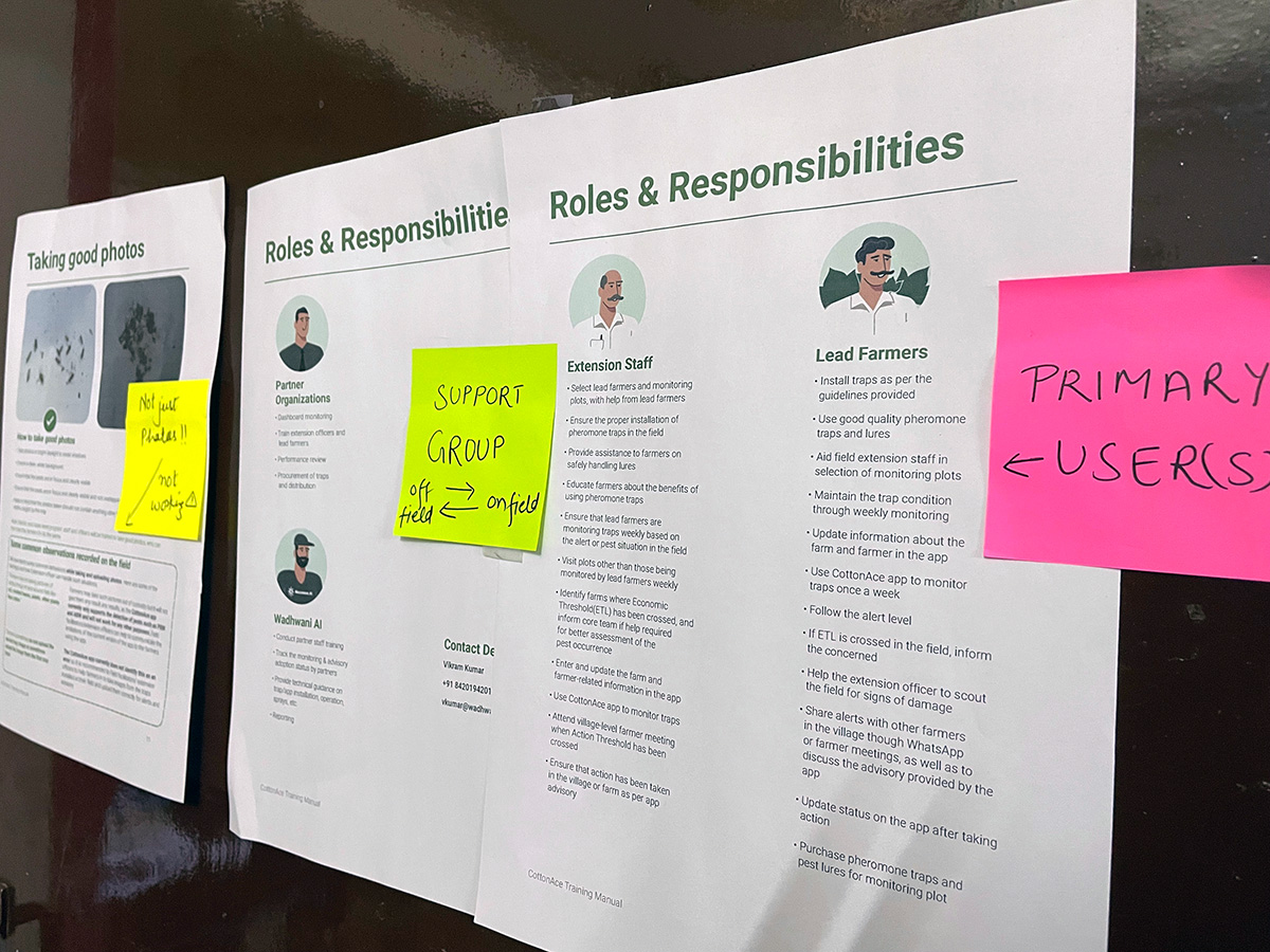
Following this field visit, I collaborated with my colleagues working on the pest management solution to gather the existing training materials that we had used in the past. I reviewed this material based on the insights gathered from the field, and it dawned on me that much of the material would be unrelatable to farmers: for it to be effective, the language used and the communication approach would have to be very different, keeping in mind their specific needs and limited exposure to technology.
The Need for a Design-Led Process
I started looking for other agencies and organizations who may have been conducting training sessions for similar low-income users, and I found that most training manuals for app-based solutions were simple instruction manuals that often assumed prior knowledge, delivered in digital formats, which clearly did not meet the needs of low-income users. To my surprise, I did not find a single training manual that was the result of a clear, design-driven process.
Why not? Was this not needed? Was it not considered necessary? Was it not a priority? There are many promising tech innovations out there that are made for this group of users: but how are the solutions being taken to them? Who is training these users? How can organizations driving tech solutions be sure that their users have enough information to actually use them?
All of these questions felt overwhelming at first, but this process helped me to align my thoughts. It made me question the need for training once again, so I conducted further, more in-depth interviews with other field facilitators and farmers to understand the issues that typically arise with in-app onboarding processes. I was validated when, again, the need for better training was clearly apparent as one of the key reasons for low adoption and the trust issues that occur frequently when app-based solutions are used in the field.
Why Focus on Low-Income Users?
Artificial intelligence, machine learning, IoT, etc. are an integral part of the tech-enabled world that we are now a part of, and inform almost every aspect of our lives. And these technologies advance fast; often more rapidly than we could imagine.
Adapting to these changes is easy for smart, educated users living in urban, tech-friendly communities. However, accepting these changes and adapting to them is much more difficult for low-income and less digital-savvy users like farmers and frontline public health workers.
It is important to remember that users in low-income communities are primarily occupied with ensuring that they have enough income to survive. They have obvious limitations around capacity, bandwidth, and even inclination, when it comes to learning new technologies and any associated processes.
New innovations for users like the aforementioned cotton farmers are mostly focused on solving their pain points first; the user experience is usually considered as a secondary objective. When I spoke to friends and fellow designers about the need to design better training manuals for farmers, I often heard statements like: ‘Everything is moving quickly to the digital medium and you are thinking about training manuals. Who needs a training manual to use Facebook?’
Many of us may not need a manual to use apps, because we have been familiar with them for a long time, and are well-acquainted with the design and content patterns in most types of apps. Users in urban communities are adapting to the digital world very fast but users like farmers are not.
Low-income users have to make more of an effort and prefer to learn at their own pace—they are willing to learn but they also have many questions and can feel stuck when things aren’t immediately clear. However, they do take the time to question, experiment, and then decide if that makes sense to them or not. These users are often presented with innovations, but without the necessary context, or opportunities to learn more, learn better and do better.
As a design researcher, I strongly believe that designers have a responsibility to their users to ensure that any tech-based solution solves the problems it intends to solve, without creating new problems in their place. I believe that designers—and the teams that they work in and with—should focus on making tech products simple enough, and their important features obvious enough, for the masses to figure out on their own.
Coming Up Next: How has Wadhwani AI incorporated these learnings into enhancing its own solutions and training materials to make them easier to use and more relevant to low-income users?


